Code
library(readr)
library(dplyr)
library(ggplot2)
library(plotly)
library(rpart)
library(rpart.plot)

set.seed(42)RFM analysis is a 30-year-old segmentation framework, originally for direct marketing. Each subject (customer or, here, product) is summarized by three numbers:
The classic application is customer scoring; we apply the same logic at the article level — which products in the catalog are healthy, which are dying, which need attention?
library(readr)
library(dplyr)
library(ggplot2)
library(plotly)
library(rpart)
library(rpart.plot)
set.seed(42)Reference date is the last day of the data window. Recency is measured in months since the article’s last sale.
.data_path <- if (file.exists("data/raw/transactions.csv")) "data/raw/transactions.csv" else "data/synthetic/transactions.csv"
raw <- read_delim(.data_path, delim = ";", show_col_types = FALSE)

REF_DATE <- max(raw$date)

rfm <- raw |>
  group_by(article_name) |>
  summarise(
    frequency = n(),
    value     = sum(gross_price),
    recency   = as.numeric(REF_DATE - max(date)) / 30.4375,  # months
    .groups   = "drop"
  )

cat(sprintf("Reference date: %s | %d articles, recency range [%.1f, %.1f] months, value range [%.0f, %.0f] EUR\n",
            format(REF_DATE), nrow(rfm), min(rfm$recency), max(rfm$recency),
            min(rfm$value), max(rfm$value)))
Reference date: 2017-06-30 | 40 articles, recency range [0.0, 3.7] months, value range [1828, 413866] EURA quick look at the marginal distributions:
library(patchwork)
p1 <- ggplot(rfm, aes(recency))   + geom_histogram(bins = 15, fill = "steelblue") + labs(x = "recency (months)")
p2 <- ggplot(rfm, aes(frequency)) + geom_histogram(bins = 15, fill = "darkorange") + labs(x = "frequency")
p3 <- ggplot(rfm, aes(value))     + geom_histogram(bins = 15, fill = "seagreen") + labs(x = "value (EUR)")
p1 + p2 + p3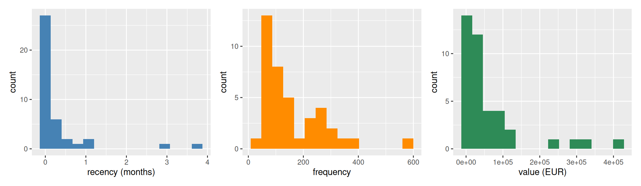
Most articles have very recent last sales — the data window ends at the reference date and most products are still selling. A small tail of articles last sold months ago — on synthetic data these are the declining products engineered into the synthesis (filing_cabinet, dvd_player); on real data they are end-of-life SKUs.
Two methodological points before fitting:
frequency and value (the heavy-tailed columns) before standardising. RFM is the classic textbook example of “always log-transform monetary value” — a few high-revenue items can otherwise pull cluster centroids towards the right tail and the boundaries land in the wrong place. We use log1p (= log(1+x)) which handles zero values gracefully. Recency stays linear (months are not heavy-tailed).# Drop articles whose total revenue is non-positive — refund/Gutschrift
# artifacts that net to <= 0. log1p(-) is NaN, which would crash kmeans.
.n_nonpos <- sum(rfm$value <= 0)
if (.n_nonpos > 0) {
cat(sprintf("Dropped %d articles with non-positive total revenue (refunds netting to <= 0)\n",
.n_nonpos))
rfm <- rfm |> filter(value > 0)
}
rfm$log_frequency <- log1p(rfm$frequency)
rfm$log_value <- log1p(rfm$value)
features <- scale(rfm[, c("log_frequency", "recency", "log_value")])
ks <- 2:10
inertias <- sapply(ks, function(k) kmeans(features, centers = k, nstart = 10)$tot.withinss)
silhouettes <- sapply(ks, function(k) {
km <- kmeans(features, centers = k, nstart = 10)
mean(cluster::silhouette(km$cluster, dist(features))[, "sil_width"])
})
p_elbow <- ggplot(data.frame(k = ks, ss = inertias), aes(k, ss)) +
geom_line() + geom_point(size = 2) +
scale_x_continuous(breaks = ks) +
labs(x = "Number of clusters", y = "Within-cluster SS", title = "Elbow")
p_sil <- ggplot(data.frame(k = ks, sil = silhouettes), aes(k, sil)) +
geom_line(color = "darkorange") + geom_point(size = 2, color = "darkorange") +
geom_hline(yintercept = 0.5, linetype = "dashed", color = "grey") +
geom_hline(yintercept = 0.2, linetype = "dotted", color = "grey") +
scale_x_continuous(breaks = ks) +
labs(x = "Number of clusters", y = "Silhouette score", title = "Silhouette")
p_elbow + p_sil
cat(sprintf("Silhouette at k=4: %.3f\n", silhouettes[which(ks == 4)]))Silhouette at k=4: 0.421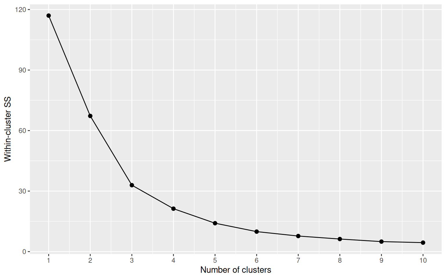
We use k = 4 to give a four-tier segmentation (R1–R4 / F1–F4 / M1–M4-style ranks). On synthetic data the bend lines up cleanly with k=4, on real data the choice is framework-driven (consistent four-tier story across BCG and RFM) — the silhouette score then tells us how clean the resulting separation actually is.
K <- 4
fit <- kmeans(features, centers = K, nstart = 25)
rfm$cluster <- fit$cluster

# Rank clusters: higher (log-)value & (log-)frequency, lower recency = better.
# Centres are in z-space (after scale()) so weights add directly.
centers <- as.data.frame(fit$centers) |>
  tibble::rowid_to_column("cluster") |>
  mutate(weight = (log_frequency + log_value - recency) / 3) |>
  arrange(desc(weight)) |>
  mutate(rank = row_number())

rfm <- rfm |>
  left_join(centers |> select(cluster, rank), by = "cluster")

centers |> select(cluster, rank, recency, log_frequency, log_value, weight) |> round(3)
cluster rank recency log_frequency log_value weight
1 2 1 -0.380 1.411 1.430 1.074
2 4 2 -0.322 0.311 0.261 0.298
3 3 3 0.009 -0.821 -0.856 -0.562
4 1 4 4.007 -1.831 -1.233 -2.357Plotly gives us a rotatable, zoomable 3D scatter — much more useful than a static projection when three axes matter.
# Density-aware marker styling: small dataset (synth, ~40 items) keeps the
# original look; large dataset (real, ~2,100 items) needs smaller faded
# markers to keep the cluster colours readable through overlap.
.marker_size    <- if (nrow(rfm) < 100) 6 else 3
.marker_opacity <- if (nrow(rfm) < 100) 0.85 else 0.45

plot_ly(
  rfm,
  x = ~recency, y = ~frequency, z = ~value,
  color = ~factor(rank),
  colors = c("#27ae60", "#3498db", "#f39c12", "#c0392b"),
  text = ~article_name,
  hovertemplate = paste0(
    "<b>%{text}</b><br>",
    "recency: %{x:.1f} mo<br>",
    "frequency: %{y}<br>",
    "value: €%{z:,.0f}<extra></extra>"
  ),
  type = "scatter3d", mode = "markers",
  marker = list(size = .marker_size, opacity = .marker_opacity)
) |>
  layout(
    scene = list(
      xaxis = list(title = "Recency (months)"),
      yaxis = list(title = "Frequency"),
      zaxis = list(title = "Monetary value (EUR)")
    ),
    legend = list(title = list(text = "<b>Rank</b>"))
)rfm |>
group_by(rank) |>
summarise(
n_products = n(),
mean_recency = round(mean(recency), 2),
mean_frequency = round(mean(frequency), 0),
mean_value = round(mean(value), 0),
examples = paste(head(article_name[order(-value)], 4), collapse = ", "),
.groups = "drop"
)# A tibble: 4 × 6
rank n_products mean_recency mean_frequency mean_value examples
<int> <int> <dbl> <dbl> <dbl> <chr>
1 1 7 0.04 345 224904 sofa, bed, mattress, …
2 2 17 0.09 168 46363 tv, wardrobe, sideboa…
3 3 14 0.34 75 11489 cabinet, dresser, gar…
4 4 2 3.4 38 7619 filing_cabinet, dvd_p…Reading the table:
The decision tree reduces the 4-cluster structure to a few interpretable splits:
tree <- rpart(rank ~ recency + frequency + value, data = rfm,
              method = "class", control = rpart.control(maxdepth = 4))
rpart.plot(tree, type = 2, extra = 100, fallen.leaves = TRUE,
           box.palette = "BuOr", main = "")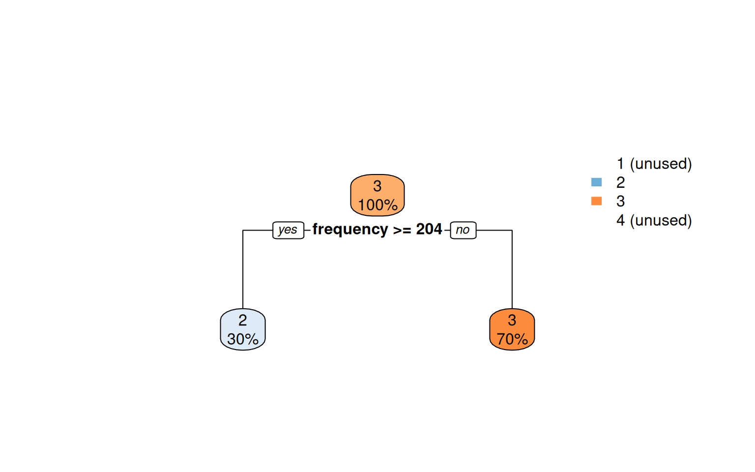
Codified as a few if-thresholds, this is a deployable scoring rule that needs no clustering library at runtime.
The Family-level scatter is detailed enough for catalog operations. For executive reporting the more digestible aggregation is Department — six store-floor sections instead of dozens of products. With six points clustering becomes pointless; we just compute R/F/M per department and read the result directly.
raw_dept <- raw |>
  filter(!is.na(department), department != "") |>
  group_by(department) |>
  summarise(
    frequency = n(),
    value     = sum(gross_price),
    recency   = as.numeric(REF_DATE - max(date)) / 30.4375,
    .groups   = "drop"
  ) |>
  arrange(desc(value))

raw_dept
# A tibble: 6 × 4
department frequency value recency
<chr> <int> <dbl> <dbl>
1 Living 2447 956087. 0
2 Bedroom 1190 769246. 0
3 Dining 1689 540159. 0.0329
4 Office 567 158775. 0
5 Storage 203 68596. 0.0657
6 Outdoor 296 45717. 0.164 ggplot(raw_dept, aes(recency, value, size = frequency, label = department)) +
geom_point(color = "#3498db", alpha = 0.7) +
geom_text(size = 4, fontface = "bold", vjust = -1.4) +
scale_size(range = c(8, 20), guide = "none") +
labs(x = "Recency (months since last sale)", y = "Total revenue (EUR)") +
theme_minimal()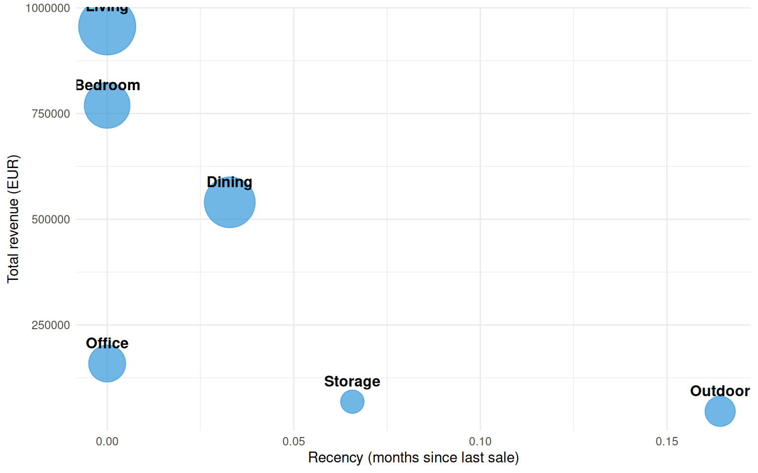
Department-level readings are coarser by design — you lose the per-product detail but gain a cleaner narrative for stakeholders who don’t want to parse a 40-point 3D scatter.
The k=4 RFM segmentation cleanly separates the catalog into a healthy core, a long middle, and a tail of dying products. The framework was originally designed for customers but transfers directly to articles — and the same techniques work for any entity you can summarize as (recency, frequency, monetary).
For the standalone Python version of this same analysis with a more interactive 3D experience, see notebooks/rfm_clustering.ipynb.