---
title: "BCG-style Clustering — Market Share × Growth"
---
The [Boston Consulting Group product matrix](https://en.wikipedia.org/wiki/Growth%E2%80%93share_matrix) is a 50-year-old framework for thinking about a product portfolio. Each product is plotted on two axes:
- **Market share** — what fraction of total revenue does this product account for?
- **Growth rate** — is the product gaining or losing ground over time?
The four quadrants give the framework its names: **Stars** (high share, high growth), **Cash Cows** (high share, low growth), **Question Marks** (low share, high growth), **Dogs** (low share, low growth).
In this chapter we recreate the BCG positioning data-driven: aggregate per-product revenue across two halves of the date range, compute share and growth, then cluster the resulting 2D positions with k-means.
## Setup
```{python}
#| label: setup
import numpy as np
import pandas as pd
# Pandas display: render full DataFrame width in chapter outputs.
pd.options.display.max_columns = None
pd.options.display.width = 200

import matplotlib.pyplot as plt
import seaborn as sns
from sklearn.cluster import KMeans
from sklearn.preprocessing import StandardScaler
from sklearn.tree import DecisionTreeClassifier, plot_tree

sns.set_theme(style="whitegrid")
RANDOM_STATE = 42
RANK_PALETTE = ["#27ae60", "#3498db", "#f39c12", "#c0392b"]  # rank 1 → 4, used in chapters 03 + dashboard too
```
## Compute share and growth
We split the data window at its midpoint and aggregate revenue per product in each half:
```{python}
#| label: aggregate
from pathlib import Path
_data_path = "data/raw/transactions.csv" if Path("data/raw/transactions.csv").exists() else "data/synthetic/transactions.csv"
df = pd.read_csv(_data_path, sep=";", parse_dates=["date"])
SPLIT = df["date"].min() + (df["date"].max() - df["date"].min()) / 2
print(f"Window: {df['date'].min().date()} → {df['date'].max().date()}, split at {SPLIT.date()}")
df["period"] = np.where(df["date"] <= SPLIT, "p1", "p2")

period_rev = (
    df.groupby(["article_name", "period"])["gross_price"].sum()
      .unstack(fill_value=0.0)
      .rename(columns={"p1": "rev_p1", "p2": "rev_p2"})
)
period_rev["revenue"] = period_rev["rev_p1"] + period_rev["rev_p2"]
period_rev["share"]   = period_rev["revenue"] / period_rev["revenue"].sum()
period_rev["growth"]  = np.where(
    period_rev["rev_p1"] > 0,
    (period_rev["rev_p2"] - period_rev["rev_p1"]) / period_rev["rev_p1"],
    np.where(period_rev["rev_p2"] > 0, 1.0, -1.0),
)
period_rev = period_rev[period_rev["share"] > 0].copy()
period_rev[["rev_p1", "rev_p2", "revenue", "share", "growth"]].head()
```
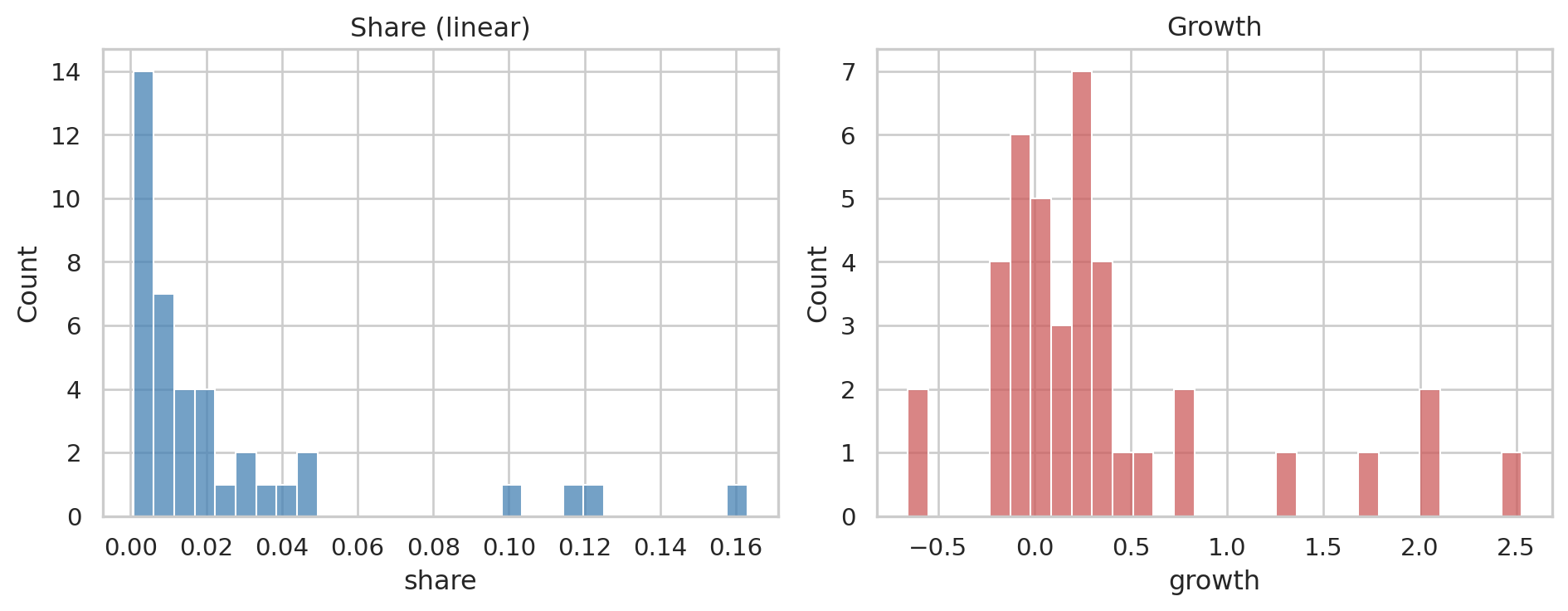
A glimpse at the distributions — both are heavily skewed, which we'll handle:
```{python}
#| label: fig-distributions
#| fig-cap: "Raw share and growth distributions. Heavy tails on both."
fig, axes = plt.subplots(1, 2, figsize=(10, 4))
sns.histplot(period_rev["share"],  bins=30, ax=axes[0], color="steelblue")
axes[0].set_title("Share (linear)"); axes[0].set_xlabel("share")
sns.histplot(period_rev["growth"], bins=30, ax=axes[1], color="indianred")
axes[1].set_title("Growth"); axes[1].set_xlabel("growth")
plt.tight_layout()
plt.show()
```
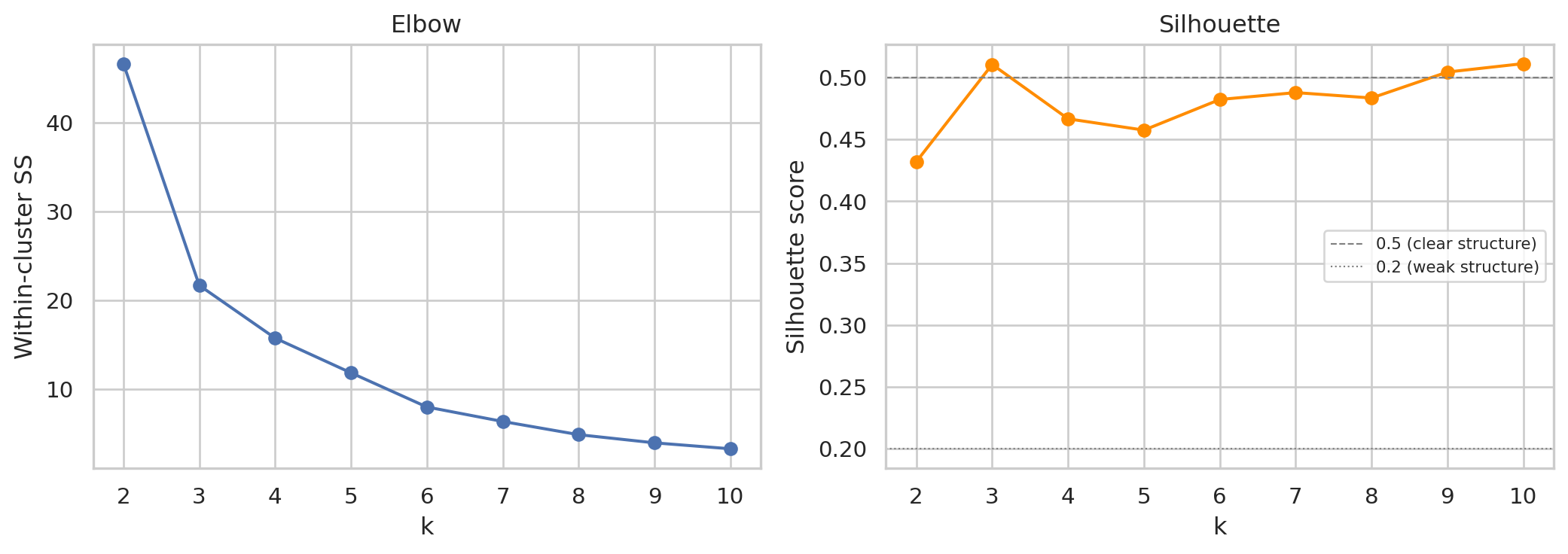
## Choosing k — elbow + silhouette
Two methodological points we get right here:
1. **Cluster on the *transformed* features, not the raw ones.** Both `share` and `growth` are heavy-tailed in retail data — a few products dominate share, a few have explosive growth. K-means is distance-based; on raw heavy-tailed features the centroids get pulled toward the outliers and the cluster boundaries land in the wrong place. Standard fix: a variance-stabilising transform before scaling. We use a **signed cube-root** (handles both signs of growth, finite at zero, doesn't require strictly-positive data the way log does).
2. **Validate k with silhouette score, not just elbow.** The elbow is a visual heuristic; silhouette score (Rousseeuw 1987) is a quantitative cluster-quality measure on `[-1, +1]` — higher is better, ≥ 0.5 typically considered "good", around 0.2–0.5 "weak structure". We plot both and pick k informed by both signals — but with the BCG framework constraint that k=4 maps onto the four quadrants.
```{python}
#| label: fig-elbow-silhouette
#| fig-cap: "Left: elbow on within-cluster sum of squares (lower is tighter). Right: silhouette score per k (higher is better, ≥ 0.5 = clear structure). Cluster fitting is on signed-cbrt-transformed share + growth (then standardised) — robust to the heavy tails that retail share/growth produce on real data."
from sklearn.metrics import silhouette_score

def signed_cbrt(x):
    return np.sign(x) * np.cbrt(np.abs(x))

# Transform first, then standardise. Cluster fitting will use this X for the
# rest of the chapter — both the chosen-k fit and the visualisation.
features_t = np.column_stack([
    signed_cbrt(period_rev["growth"].values),
    signed_cbrt(period_rev["share"].values),
])
X = StandardScaler().fit_transform(features_t)

ks = range(2, 11)
inertias = []
silhouettes = []
for k in ks:
    km_k = KMeans(n_clusters=k, random_state=RANDOM_STATE, n_init=10).fit(X)
    inertias.append(km_k.inertia_)
    silhouettes.append(silhouette_score(X, km_k.labels_))

fig, axes = plt.subplots(1, 2, figsize=(11, 4))
axes[0].plot(list(ks), inertias, marker="o")
axes[0].set_xlabel("k"); axes[0].set_ylabel("Within-cluster SS"); axes[0].set_title("Elbow")
axes[1].plot(list(ks), silhouettes, marker="o", color="darkorange")
axes[1].axhline(0.5, color="grey", ls="--", lw=0.8, label="0.5 (clear structure)")
axes[1].axhline(0.2, color="grey", ls=":",  lw=0.8, label="0.2 (weak structure)")
axes[1].set_xlabel("k"); axes[1].set_ylabel("Silhouette score"); axes[1].set_title("Silhouette")
axes[1].legend(fontsize=8)
plt.tight_layout()
plt.show()

print(f"Silhouette at k=4: {silhouettes[ks.index(4) - ks.start]:.3f}")
```
We use **k = 4** to map onto the four BCG quadrants. On synthetic data the elbow lines up cleanly with that choice and silhouette is reasonable; on real data the curves are typically smoother — the choice becomes framework-driven (we want exactly four tiers for executive reporting) rather than purely data-driven, and the silhouette tells us how clean the resulting separation actually is. A weak silhouette is itself useful information: it says "yes there are tiers, but the boundaries are fuzzy", which a stakeholder needs to know.
## Fit the clusters
```{python}
#| label: fit-kmeans
K = 4
km = KMeans(n_clusters=K, random_state=RANDOM_STATE, n_init=10).fit(X)
period_rev["cluster"] = km.labels_

# Rank clusters by a simple "value" weight = ½·share + ½·growth (both
# transformed + standardised, so on the same scale)
centers = pd.DataFrame(km.cluster_centers_, columns=["growth_z", "share_z"])
centers["weight"] = 0.5 * centers["growth_z"] + 0.5 * centers["share_z"]
centers["rank"]   = centers["weight"].rank(ascending=False).astype(int)

# Map cluster id → rank, keeping article_name as the index of period_rev
period_rev["rank"] = period_rev["cluster"].map(centers["rank"])
period_rev[["share", "growth", "cluster", "rank"]].sort_values("rank").head()
```
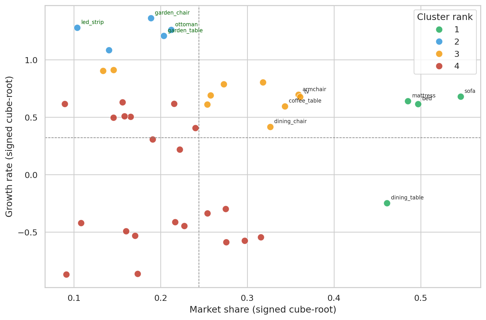
## The BCG plot
Same signed-cube-root transform we already used for clustering — visualising on the same coordinates the cluster algorithm actually saw, so the quadrant lines and cluster boundaries stay consistent:
```{python}
#| label: fig-bcg
#| fig-cap: "Products positioned by transformed share × growth (same coordinates the clustering used). Quadrants split at the data-driven mean of each axis. Cluster numbers are ranked: 1 = top performers, 4 = lagging. On real data (~2,100 products) only the top performers are annotated to keep the plot readable; all points are still in the cluster fit."
plot_df = period_rev.copy()
plot_df["share_t"]  = signed_cbrt(plot_df["share"])
plot_df["growth_t"] = signed_cbrt(plot_df["growth"])

# Density-aware visual properties: small dataset (synth, 40 items) keeps the
# original styling; large dataset (real, ~2,100 items) shrinks markers and
# fades them so the cluster colours stay readable through overlap.
n_items = len(plot_df)
marker_size  = 80 if n_items < 100 else 20
marker_alpha = 0.85 if n_items < 100 else 0.45
n_top_share  = 8 if n_items < 100 else 20
n_top_growth = 4 if n_items < 100 else 8

fig, ax = plt.subplots(figsize=(9, 6))
sns.scatterplot(
    data=plot_df, x="share_t", y="growth_t",
    hue="rank", palette=RANK_PALETTE, s=marker_size, alpha=marker_alpha,
    ax=ax, legend="full",
)
ax.axhline(plot_df["growth_t"].mean(), color="grey", lw=0.8, ls="--")
ax.axvline(plot_df["share_t"].mean(),  color="grey", lw=0.8, ls="--")

# Annotate the most informative points only — top by share (existing big
# players) and top by growth (rising stars). On large catalogues annotating
# everything would render the chart unreadable.
for _, r in plot_df.nlargest(n_top_share, "share").iterrows():
    ax.annotate(r.name, (r["share_t"], r["growth_t"]),
                xytext=(5, 5), textcoords="offset points", fontsize=7)
for _, r in plot_df.nlargest(n_top_growth, "growth").iterrows():
    ax.annotate(r.name, (r["share_t"], r["growth_t"]),
                xytext=(5, 5), textcoords="offset points", fontsize=7, color="darkgreen")

ax.set_xlabel("Market share (signed cube-root)")
ax.set_ylabel("Growth rate (signed cube-root)")
ax.legend(title="Cluster rank")
plt.tight_layout()
plt.show()
```
## Who is in each cluster?
```{python}
#| label: cluster-membership
# Sort by revenue so the per-cluster members list shows the most relevant
# items first instead of an alphabetical slice — important on real data
# where each cluster can hold hundreds of items.
period_rev_by_rev = period_rev.reset_index().sort_values("revenue", ascending=False)
summary = (
    period_rev_by_rev
    .groupby("rank")
    .agg(
        n_products=("article_name", "count"),
        mean_share=("share",  "mean"),
        mean_growth=("growth", "mean"),
        members=("article_name", lambda s: ", ".join(s.iloc[:6]) + ("…" if len(s) > 6 else "")),
    )
    .reset_index()
    .sort_values("rank")
)
summary
```
Reading the clusters in order:
- **Rank 1 (top right)** — high share *and* growing. These are the products to amplify.
- **Rank 2 / 3** — mixed positions: high share + low growth (mature workhorses), or low share + high growth (rising bets).
- **Rank 4 (bottom left)** — low share *and* shrinking. End-of-life candidates.
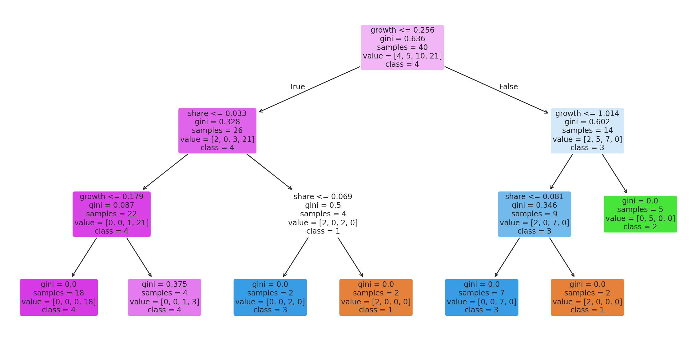
## Deriving rules from the clusters
A decision tree on the same features tells us, in plain language, which thresholds the clustering effectively picked:
```{python}
#| label: fig-tree
#| fig-cap: "Decision tree learned to predict cluster rank from raw share and growth. Read each split as: 'if growth ≤ X and share ≤ Y, then cluster Z'."
tree = DecisionTreeClassifier(
    max_depth=3, random_state=RANDOM_STATE,
).fit(period_rev[["growth", "share"]], period_rev["rank"])

fig, ax = plt.subplots(figsize=(12, 6))
plot_tree(
    tree, feature_names=["growth", "share"], class_names=[str(i) for i in sorted(period_rev["rank"].unique())],
    filled=True, rounded=True, fontsize=9, ax=ax,
)
plt.tight_layout()
plt.show()
```
This tree could be deployed as a simple if/else in any system that needs to place a new product into the BCG framework — no full k-means re-fit required.
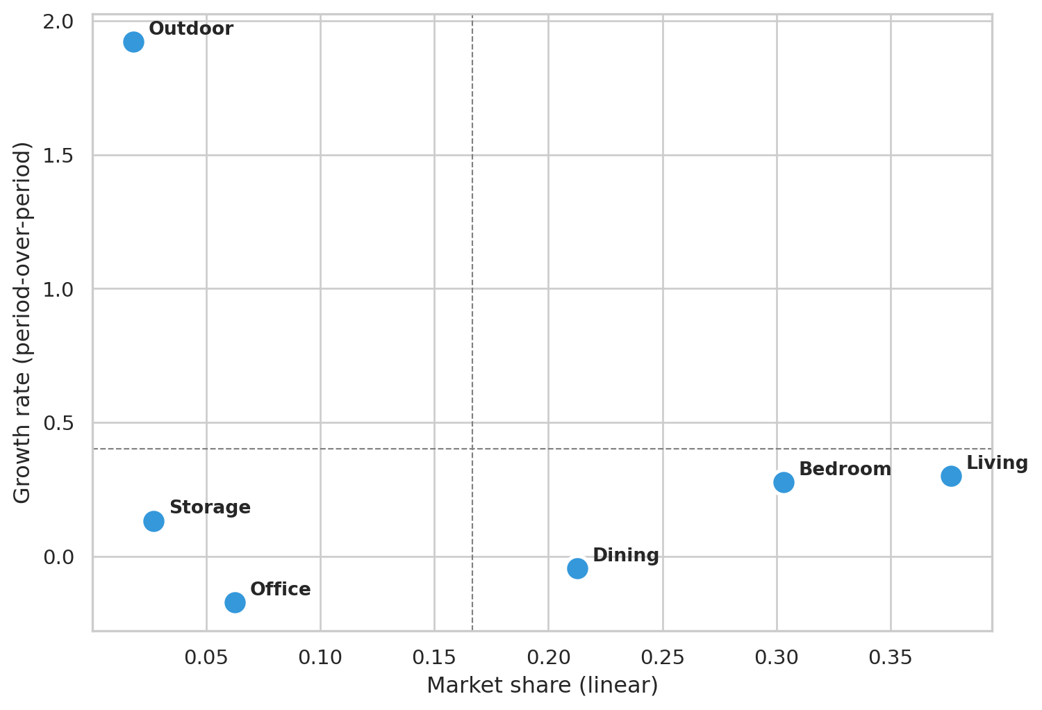
## Coarse view — BCG at Department level
The Family-level plot above is the operational view: which *products* to amplify or rationalize. For executive reporting the more useful aggregation is **Department** — six store-floor sections instead of dozens of products. Six points are too few for k-means (the elbow is meaningless), so we just compute share and growth per department and read the quadrants directly.
```{python}
#| label: fig-bcg-dept
#| fig-cap: "Same share × growth space, aggregated to Department. Quadrant lines at the cross-department mean. Useful for budget conversations: which sections of the floor are growing, which are mature."
df_dept = df[df["department"].astype(str) != ""].copy()
period_rev_dept = (
    df_dept.groupby(["department", "period"])["gross_price"].sum()
           .unstack(fill_value=0.0)
           .rename(columns={"p1": "rev_p1", "p2": "rev_p2"})
)
period_rev_dept["revenue"] = period_rev_dept["rev_p1"] + period_rev_dept["rev_p2"]
period_rev_dept["share"]   = period_rev_dept["revenue"] / period_rev_dept["revenue"].sum()
period_rev_dept["growth"]  = np.where(
    period_rev_dept["rev_p1"] > 0,
    (period_rev_dept["rev_p2"] - period_rev_dept["rev_p1"]) / period_rev_dept["rev_p1"],
    np.where(period_rev_dept["rev_p2"] > 0, 1.0, -1.0),
)
period_rev_dept = period_rev_dept[period_rev_dept["share"] > 0].copy()

fig, ax = plt.subplots(figsize=(8, 5.5))
ax.scatter(period_rev_dept["share"], period_rev_dept["growth"],
           s=180, color="#3498db", edgecolor="white", linewidth=2)
for dept, row in period_rev_dept.iterrows():
    ax.annotate(dept, (row["share"], row["growth"]),
                xytext=(8, 4), textcoords="offset points", fontsize=10, fontweight="bold")
ax.axhline(period_rev_dept["growth"].mean(), color="grey", lw=0.8, ls="--")
ax.axvline(period_rev_dept["share"].mean(),  color="grey", lw=0.8, ls="--")
ax.set_xlabel("Market share (linear)")
ax.set_ylabel("Growth rate (period-over-period)")
plt.tight_layout()
plt.show()

period_rev_dept[["revenue", "share", "growth"]].round({"revenue": 0, "share": 3, "growth": 3})
```
Department-level readings are coarser by design — you lose the per-product detail but gain a cleaner narrative for stakeholders who don't want to parse a 40-point scatter plot.
## Takeaway
The k=4 clustering recovers the BCG framework directly from data: growing products land in the top-right (Stars), declining ones in the bottom-left (Dogs), mature high-volume products as Cash Cows in the middle-right, low-share / high-growth as Question Marks. On synthetic data the clusters reproduce the engineered trends; on real data they reflect the actual catalog dynamics over the observed window.
For a real retailer, the actionable read is *don't* spread marketing budget evenly across the catalog. Lean into Stars and rising Question Marks, milk Cash Cows for the cash they generate, and rationalize the Dogs (delist or replace).